EDA Plot Essentials — A Beginner’s Guide
TL;DR (Cheat-Sheet)
- Scatter plot (num vs num): relationships, clusters, outliers.
- Box plot (num vs cat): compare distributions across categories.
- Count plot (cat): check balance of classes.
- Pie chart (cat): quick snapshot of proportions (≤5 groups).
- Bar plot (num vs cat, aggregated): compare means or totals.
- KDE plot (num): visualize smooth distribution curves.
- Heatmap (cat vs cat): show counts/associations in cross-tabs.
- Line plot (num vs time): track changes and trends over time.
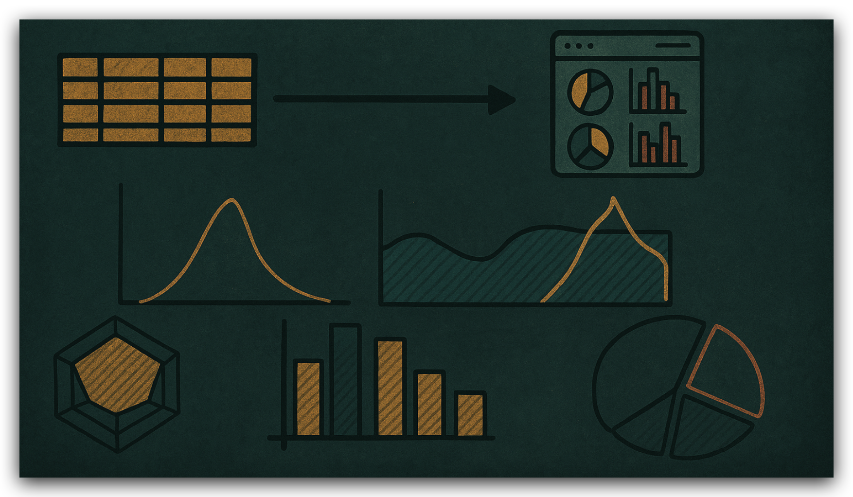
Why Plots Matter in EDA
Numbers in tables can hide structure. Visuals reveal relationships, trends, and anomalies instantly.
The trick isn’t just to make plots — it’s knowing which plot answers which question.
This guide shows the core EDA plot types, when to use them, and what to look for.
Scatter Plot — numeric vs numeric
When to use: explore relationships between two numeric variables.
- Highlights correlations, clusters, and outliers.
- Can add color (
hue) or style (marker) for subgroup comparisons.
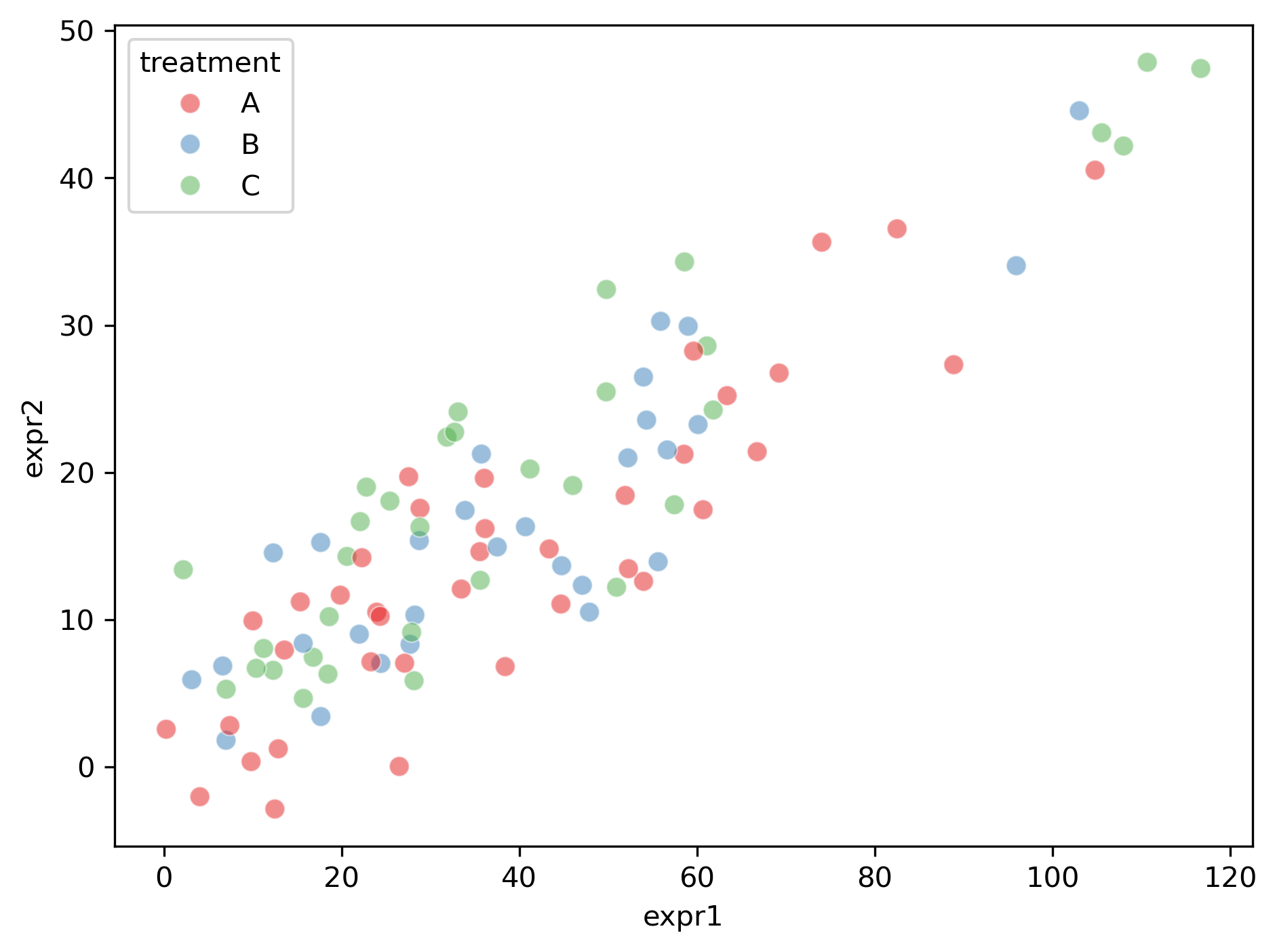 | 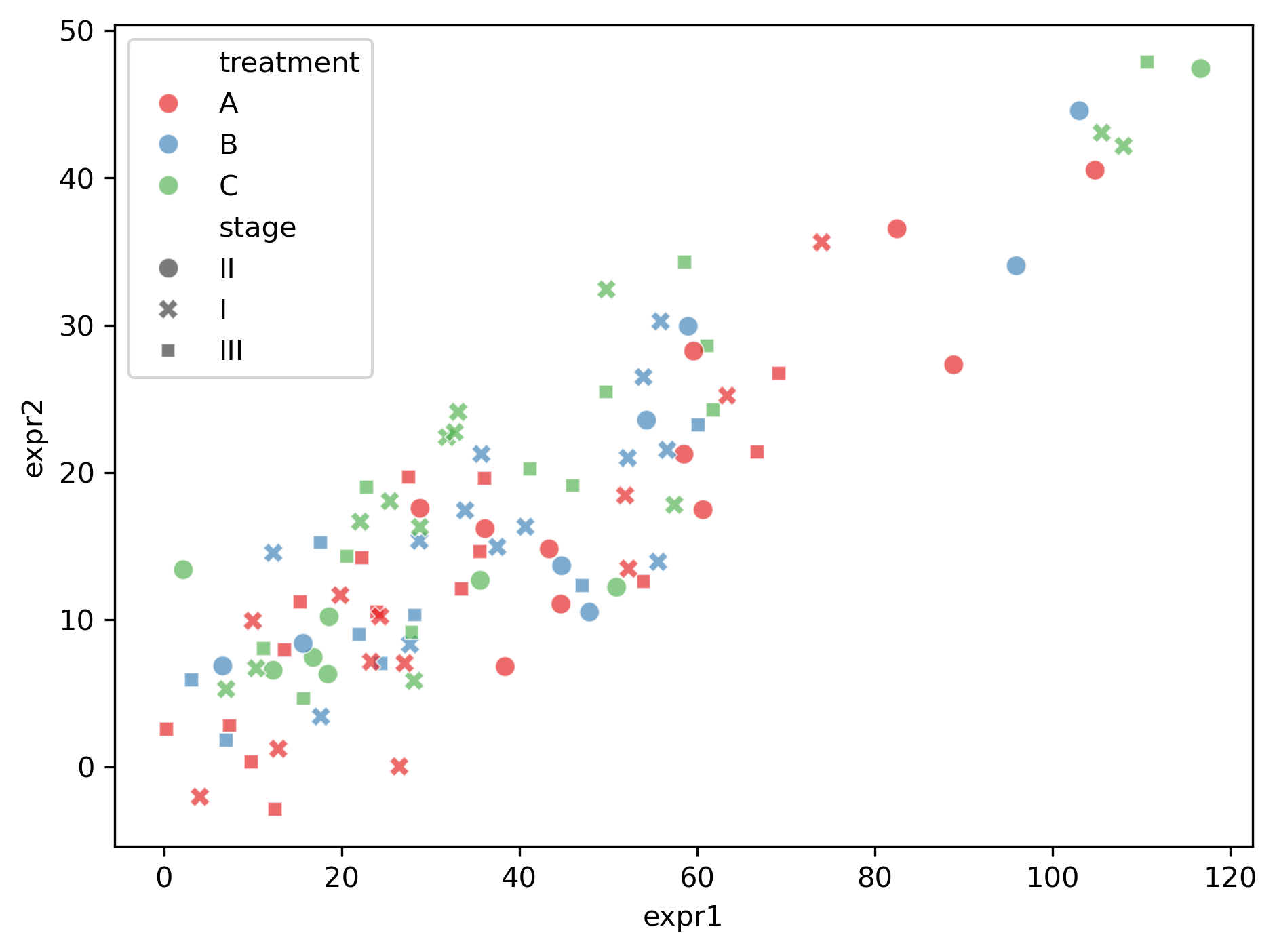 | 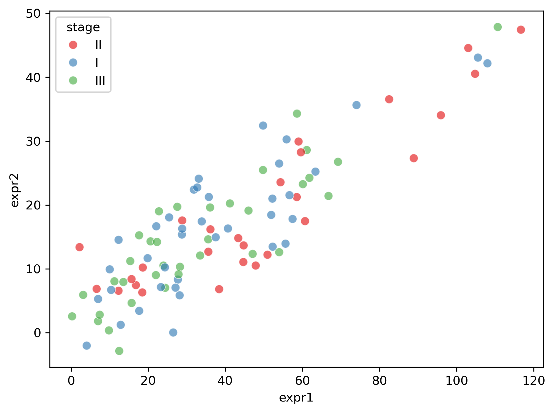 |
|---|---|---|
| hue = treatment (vs expr1) | hue,style = treatment,stage (vs expr2) | hue = stage (vs expr2) |
Example use:
expr1vsexpr2to check if expression levels rise together.
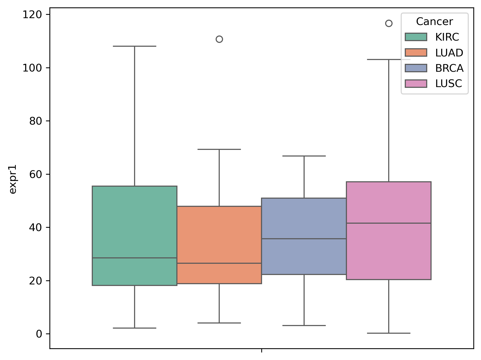
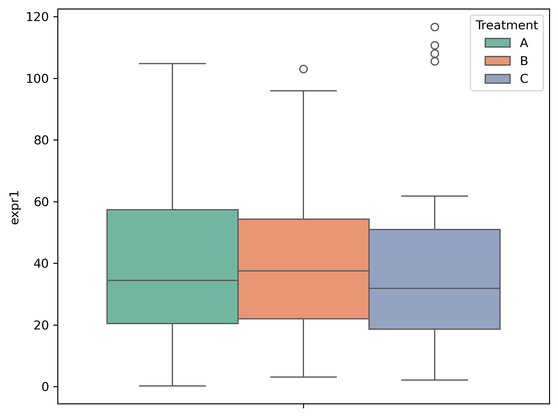
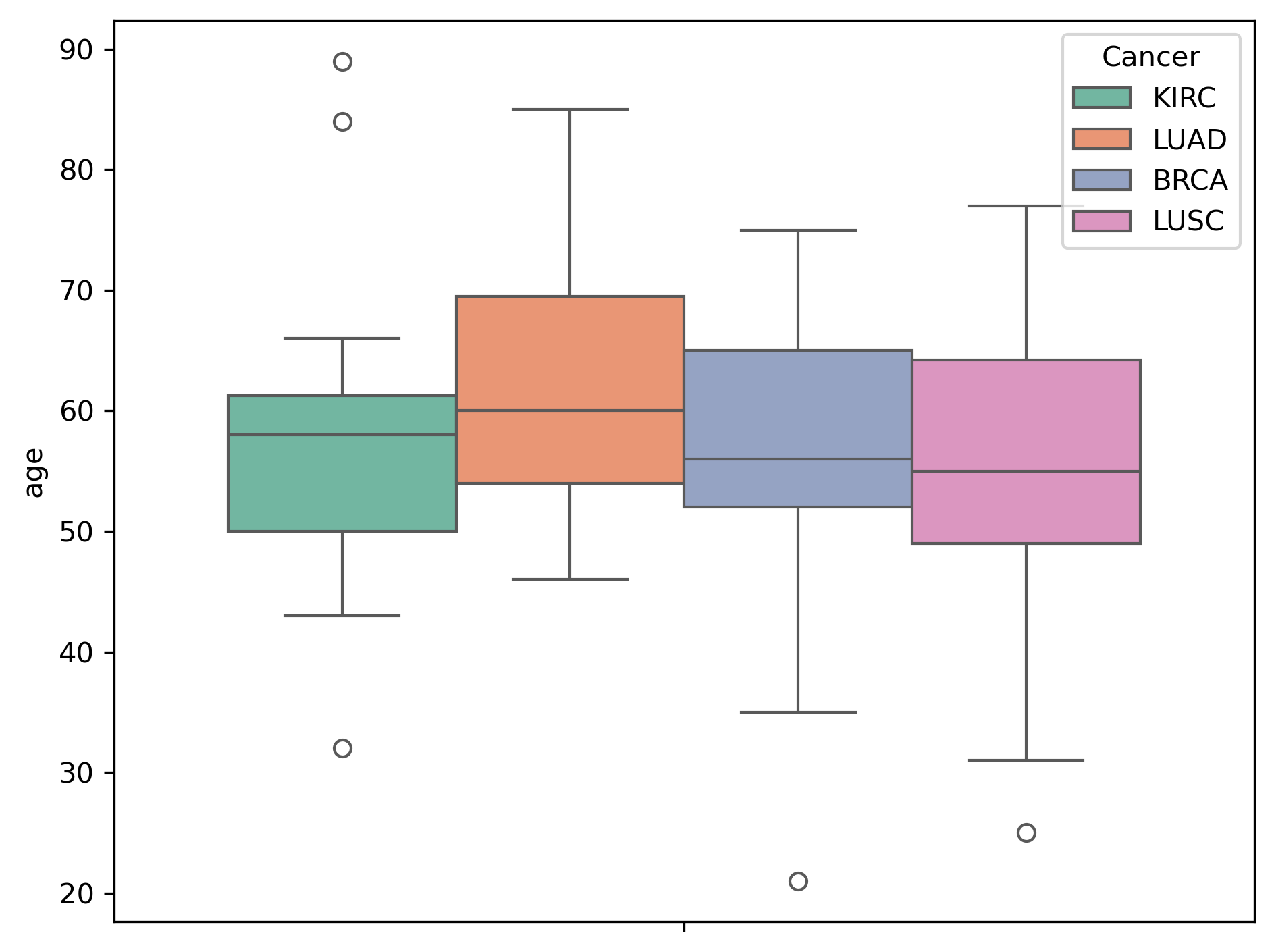
Box Plot — numeric vs categorical
When to use: compare numeric distributions across categories.
- Median, quartiles, and outliers are visible at a glance.
- Useful for spotting differences in spread or group medians.
 |  |  |
|---|---|---|
| hue = cancer (vs expr1) | hue = treatment (vs expr1) | hue = cancer (vs age) |
Add jittered/swarm points for more transparency about sample sizes.
Count Plot — categorical counts
When to use: check balance across categories.
- Especially important before classification tasks.
- Imbalanced classes can bias models and metrics.
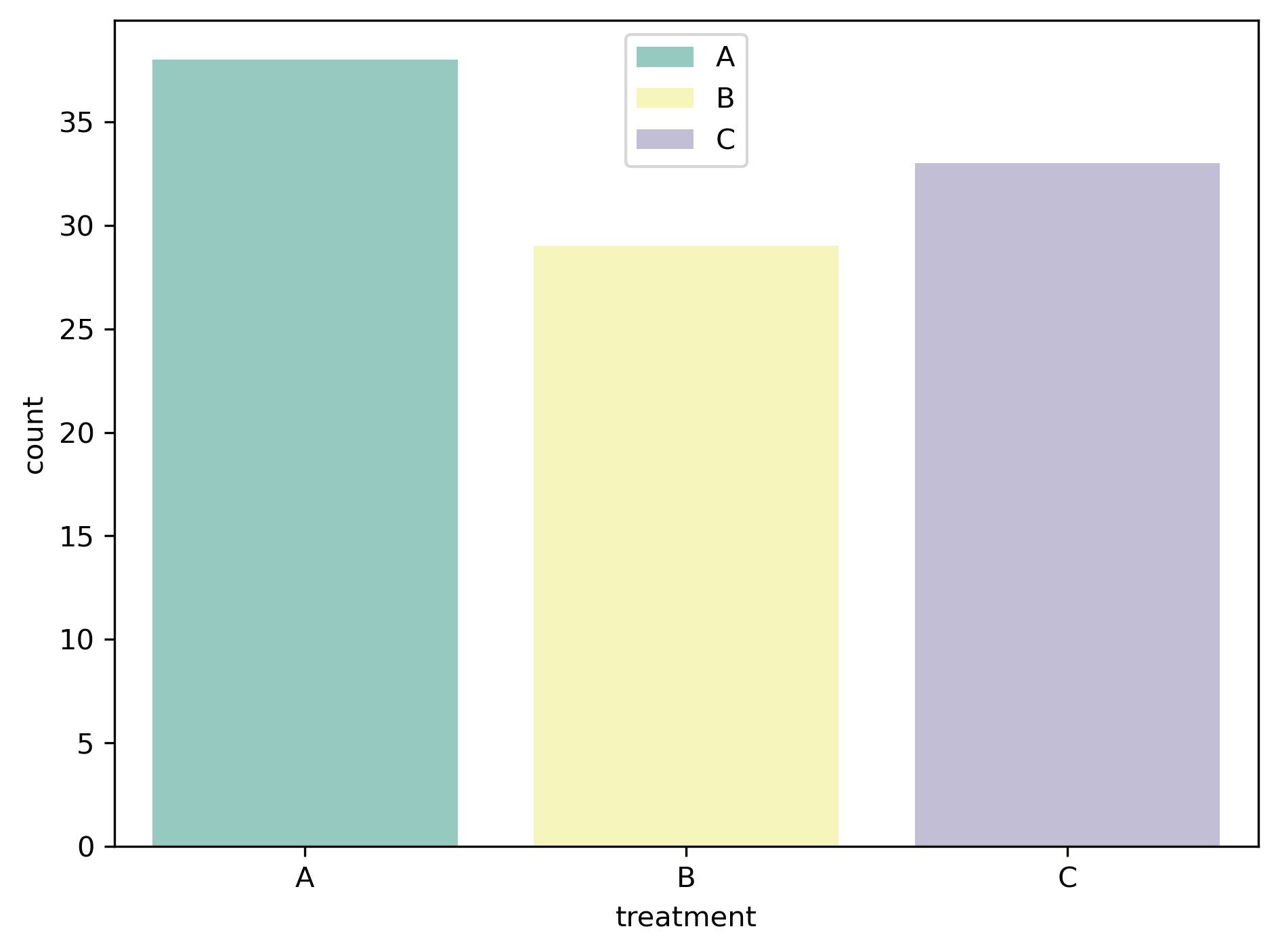
Can add
hueto compare counts across subgroups.
Pie Chart — composition snapshot
When to use: quick sense of proportions (≤5 categories).
- Clear for presentations, less precise for analysis.
- Percentages communicate the part-to-whole relationship.
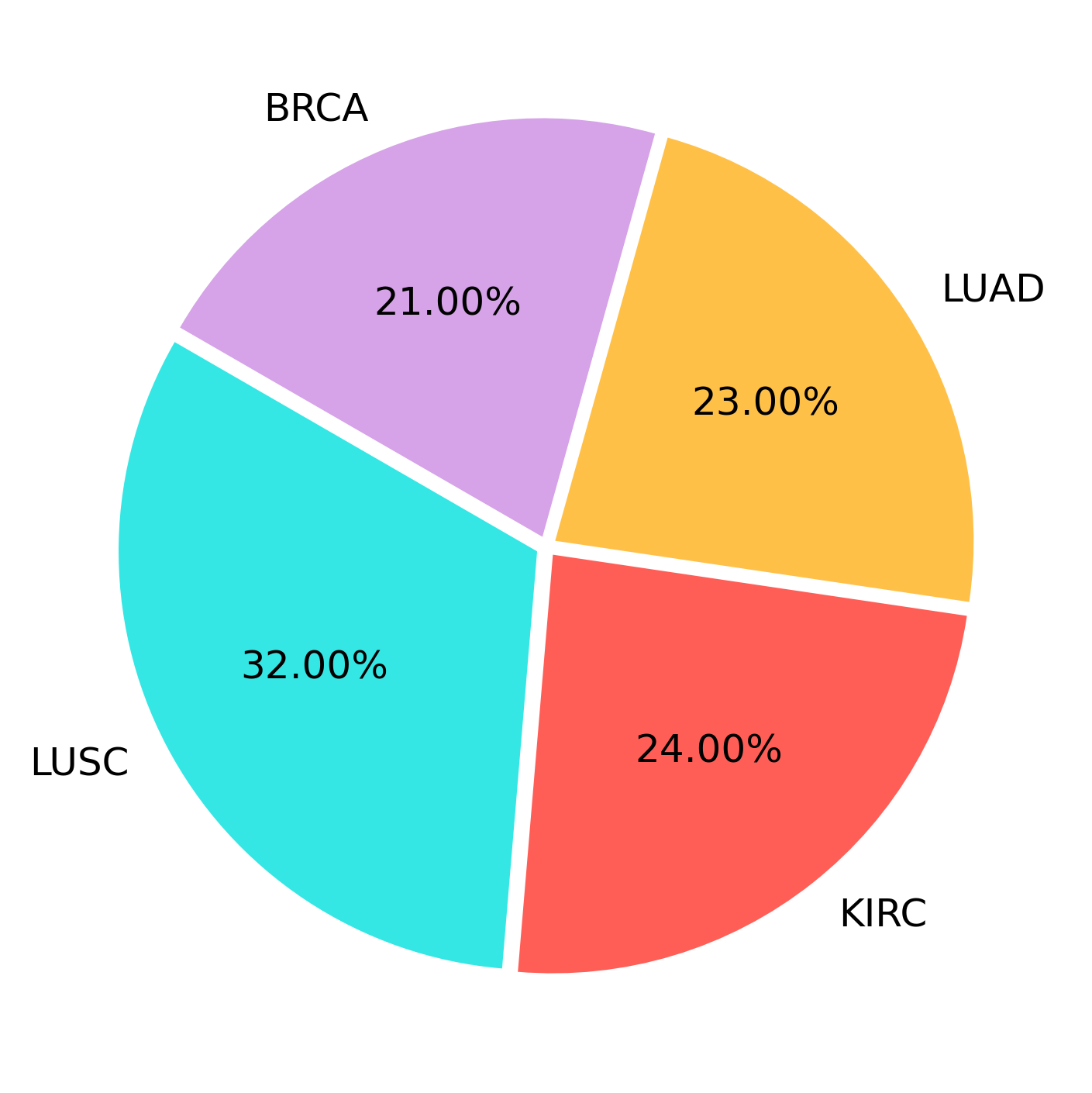
Switch to bar plots if you need exact comparison between groups.
Bar Plot — aggregated numeric vs categorical
When to use: compare aggregated values (mean, sum, median) across categories.
- Clean view of group averages or totals.
- Often paired with error bars for uncertainty.
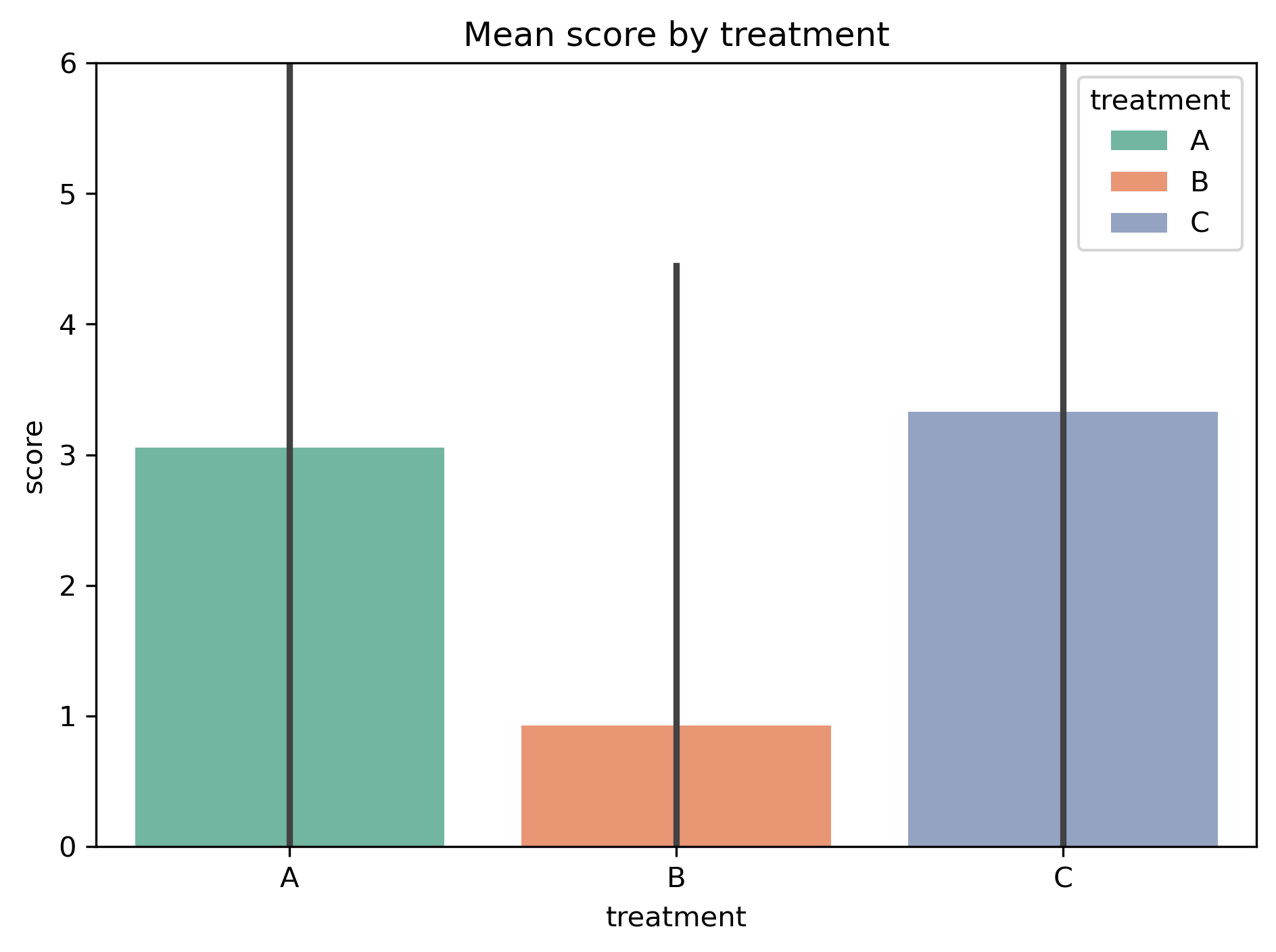
Great for high-level summaries; switch to box/violin if you care about spread.
KDE Plot — numeric distribution
When to use: understand the shape of a distribution.
- Smooth alternative to histograms.
- Highlights peaks, skewness, and multimodality.
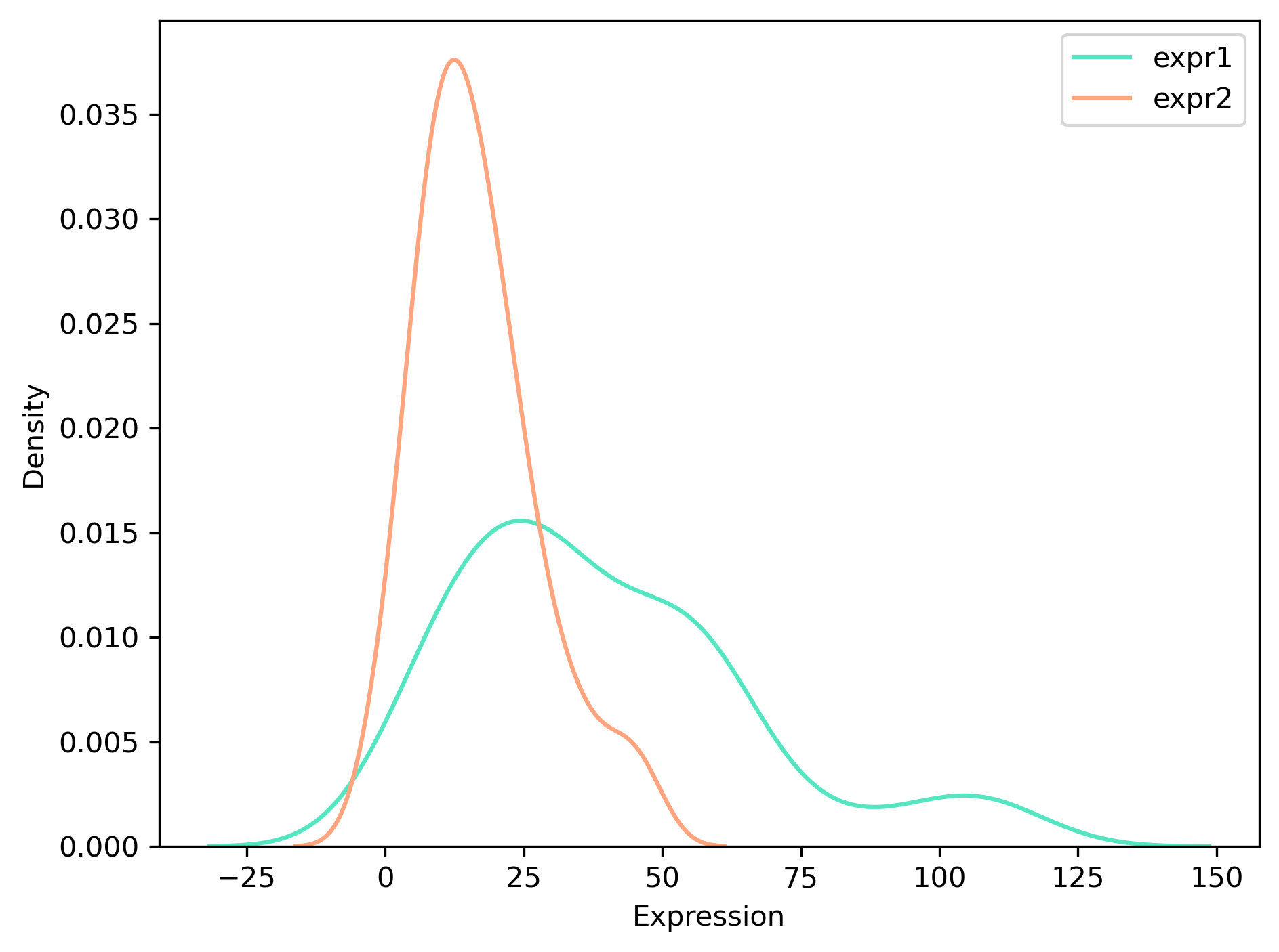
Adjust smoothing with
bw_adjustto reveal or hide detail.
Heatmap — categorical × categorical
When to use: explore associations between two categorical variables.
- Each cell shows frequency (or percentage) of a category pair.
- Color gradient highlights over- or under-represented combinations.
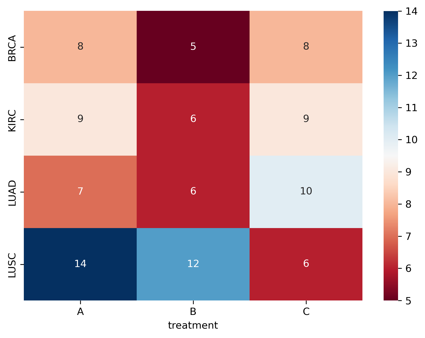
Combine with chi-square tests to test if association is statistically significant.
Line Plot — numeric vs time
When to use: follow trends and patterns across time.
- Ideal for daily/weekly/monthly metrics.
- Useful for spotting spikes, seasonality, or drift.
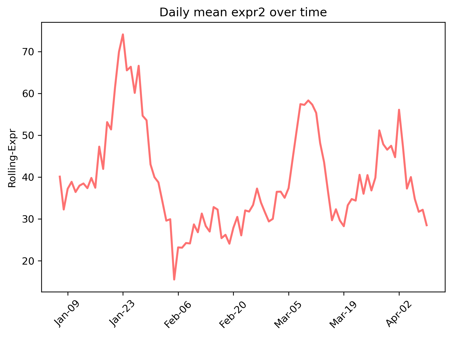
Smooth with rolling averages to highlight long-term patterns.
Final-Notes
EDA plots are your first microscope into data:
- Scatter plots show relationships.
- Box/bar plots compare groups.
- Count/pie plots check balance.
- KDE/heatmaps reveal distributions and associations.
- Line plots capture trends over time.
The goal isn’t to generate every plot — it’s to pick the simplest visualization that answers your question clearly.
Full notebook: GitHub